
politiCHAOS | Card Game
Tools: Figma, Clip Studio Paint, nanDECK
Skills: UX Research, Graphic Design, Game Design
Overview
In fall 2020 I worked with a classmate to design a card game for the final project of our game design course. I lead playtesting sessions, incorporated player feedback into the development process, and designed both the cards and the rulebook for the game. After the course I continued to conduct playtests and created a second version to address player experience issues.
The game design document from the course is available here for a more detailed report on the initial design process.
Finding Fun
The game went through several revisions throughout the course. It actually started out as a territorial acquisition game, where players solved problems with resources to gain support in regions around a board for their election campaign. However, initial player feedback thought that this concept was over-complicated, boring, and had no unique mechanics.
Cards were introduced in an attempt to solve the “no-fun” problem. The second version of the game instead had players move around the board to play action cards in specific regions. I then ran playtesting sessions (remotely, which was a challenge in and of itself) to test if cards made the game more fun.
They did not. Players thought that moving around the board felt useless, the numbers and balance were wildly off, and the core gameplay loop was not engaging and repetitive. However, players also liked the concept of fantasy politics and solving problems with cards in their hand.
Goal: Make gameplay more engaging without compromising positively-received mechanics
When in Doubt, Throw it Out
One of my favourite brainstorming methods is “brainwriting”, where no idea is rejected and you just throw ideas on paper no matter how terrible they may seem. It was by using this method that the key to the “no-fun” problem surfaced—just remove the board!
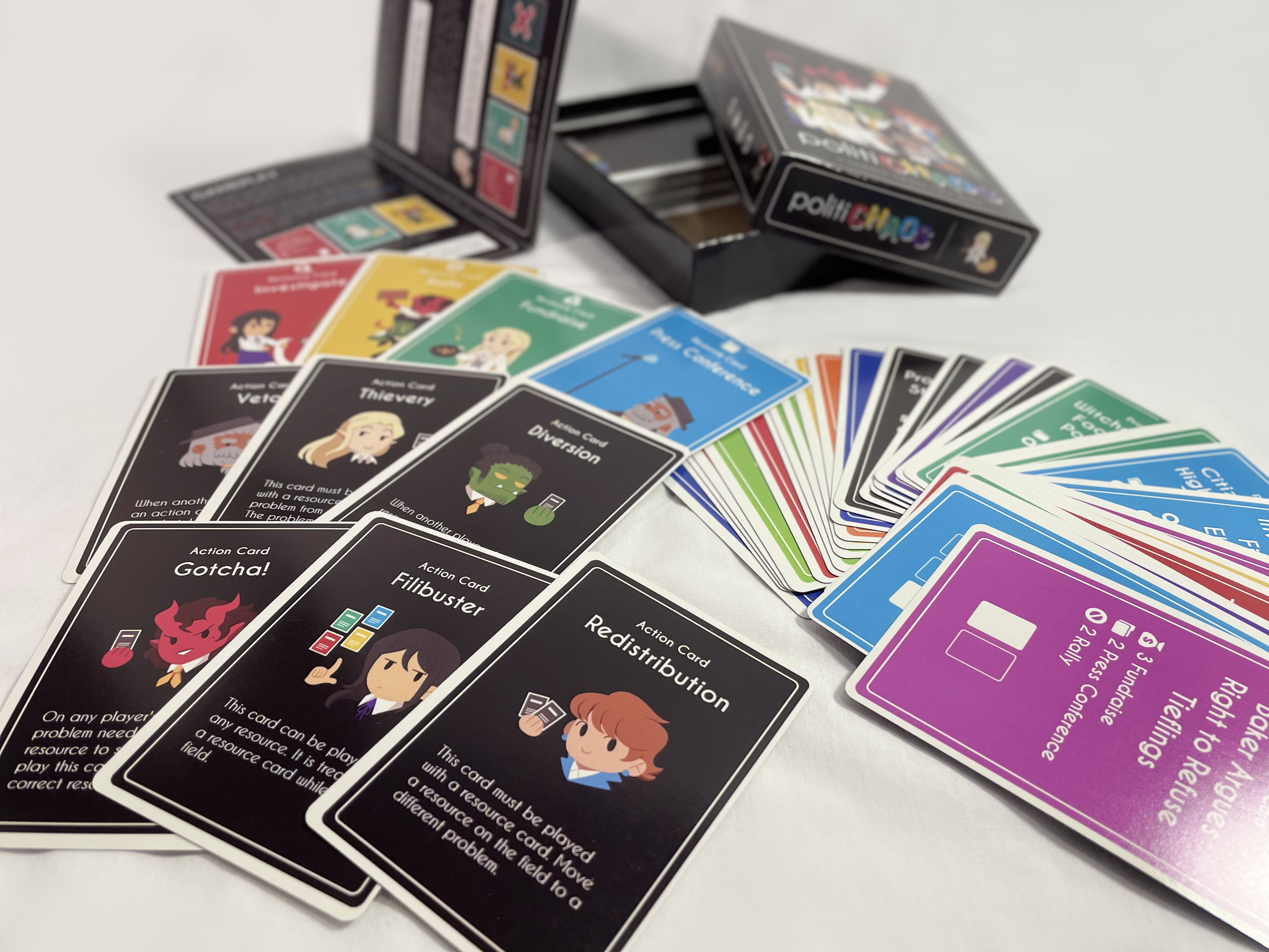
The board had carried over from the territorial acquisition version of the game and was by far the largest player complaint. With the board gone, the gameplay shifted so that players created a “board” with cards instead. This focused the identity of the game into the set-collecting card game that politiCHAOS is today.
Side Matters
I focused more on game design rather than physical design during the course due to its limited timeline. Because of this, the first cards were mostly text-based and created manually in Clip Studio Paint. This was a terrible idea since I had to add text, art, and logos to every card, and position every element by hand.
I wanted to get a copy of politiCHAOS printed so I could conduct tests with a higher quality version than my paper-and-tape cards. However, to save money I tried to condense the rulebook onto a double-sided sheet of paper. I found that when you cut costs, it creates additional problems such as unclear card interactions and a lack of detail on how to set up the game. Lesson learned!
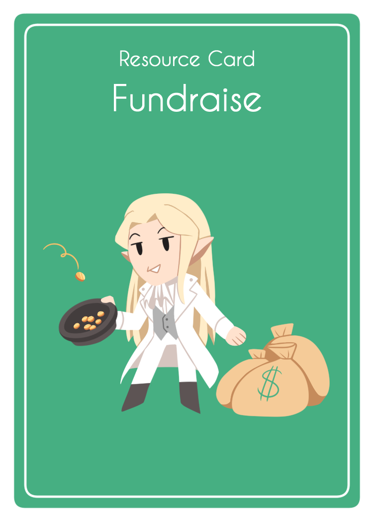
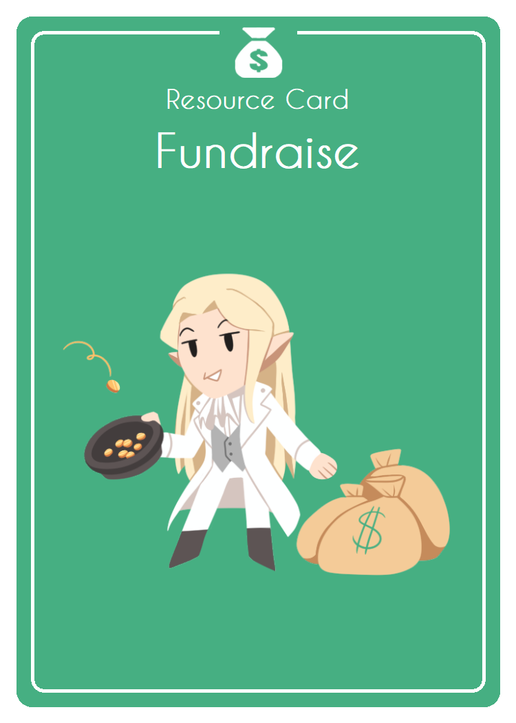
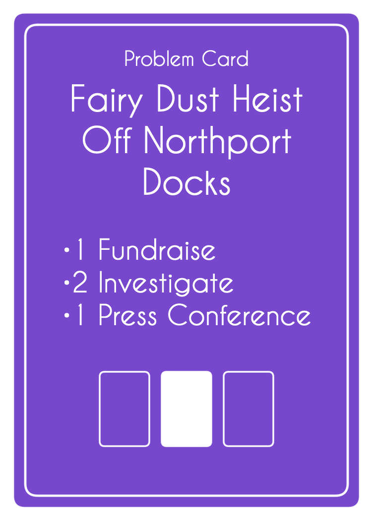
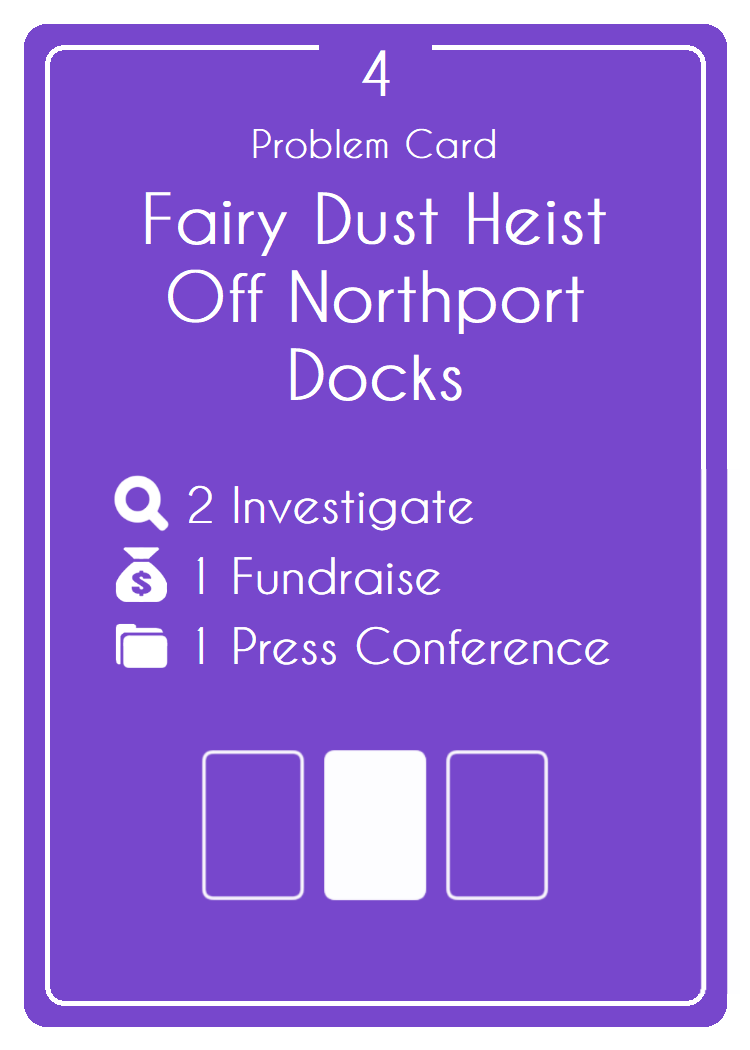
Finally, the largest takeaway from playtests with the printed version was that cards were difficult to read if you were on the wrong side of the table. While the resource cards were colour-coordinated, the problem cards relied heavily on text to describe which cards were needed.
Goal: Improve card readability and write a more in-depth rulebook
Redesigns and Rulebooks
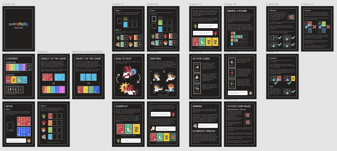
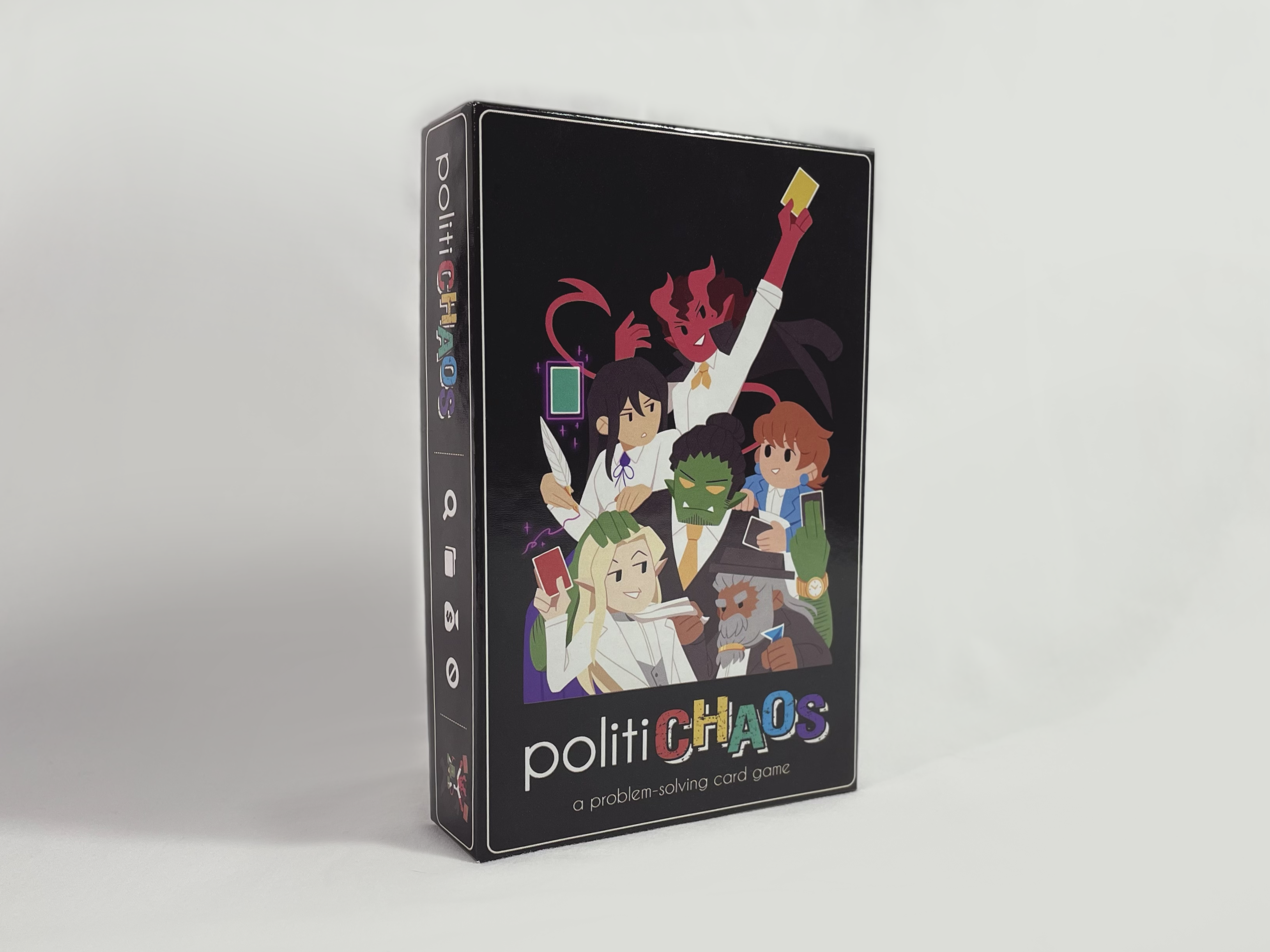
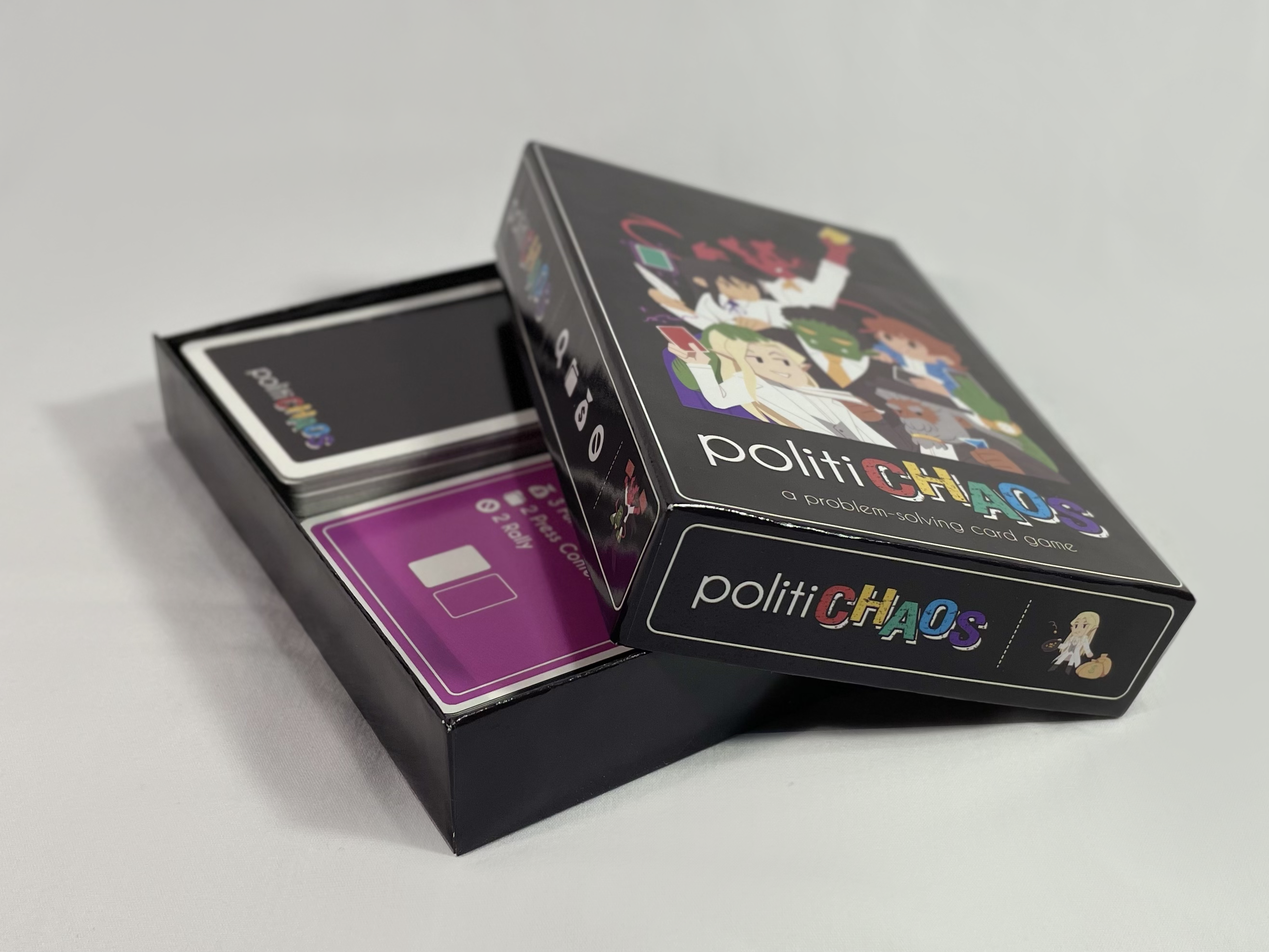
I first decided to create a better rulebook. With a larger (and slightly more pricy) box, I could have a twenty-page booklet instead of a piece of paper. I used Figma to design each page of the rulebook as well as the layout of the box art.
The next challenge was to address card clarity issues. I wanted to try adding symbols corresponding to each resource that could be read while upside down. However, remember that I had manually created each card? That came back to bite me, so I decided for a fresh start with the card-making program nanDECK. This allowed me to “program” each card using data from a spreadsheet, which was way faster than by hand, and had the added bonus of doing all the text alignment for me.
With the cards successfully recreated in nanDECK, I added resource symbols, number totals to the problem cards, and listed resources based on how many were needed rather than alphabetically.
Final Product
Finally, I had a second version of the game printed. Initial playtests with this version confirmed that the rulebook is easier to understand, the cards are easier to read upside down, and that most “edge-case” card interactions were addressed in the rules.
Next Steps
While the second version is much better than the previous version, I'm still not done—I've already gathered more feedback from a different set of players and have more improvements to make regarding readability, rulebook clarity, and game length. However, I can see a definite improvement between versions and am committed to designing the best possible version of the game before getting it out into the world.